Reviews / Showit Template

St. Vincent

A refined, conversion-minded Showit website template built for wedding photographers, planners, and luxury service providers. Designed to showcase a portfolio beautifully while guiding visitors to inquiry.

Showit Template Category
$699 (or 3 payments of $250) Price
5.0★★★★★ Average rating from 10 reviews
View on daveyandkrista.com   View live demo
St. Vincent showit template
★★★★★

It didn’t take long to realize that I could combine my love of design with weddings

Read the full review

I was raised in the south, but my passion for the mountains led me to Vail, Colorado in

2004. With a degree in architecture, I initially pursued that path, but when the 2009-2010

recession hit, I pivoted. I began taking graphic design classes while working for a wedding

planner. It didn’t take long to realize that I could combine my love of design with weddings

by starting a stationery business. So, in 2011 I started Four 13 Designs, a high-end luxury

stationery company that focuses on custom wedding invitations, stationery, signage &

more.

My previous website was outdated and didn’t provide a great experience on mobile

devices. As I serve high-end luxury clients, my old site didn’t reflect the same level of

quality I want to give to them. The design felt stagnant and needed to be upgraded to match

the elevated standards of my brand.

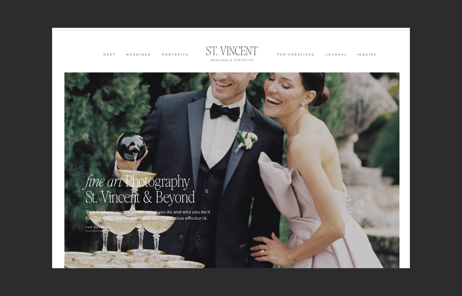
It’s sophisticated. It shows off my work in a beautiful and elevated way, while being

functional and easy to navigate.

After some research I realized that I needed to switch website platforms. As a graphic

designer, I love design, but don’t have the skill set for web design (i.e. coding, etc). I found

that Showit allowed me to do that. Then I discovered Davey & Krista’s Showit templates.

They are beautiful, elegant templates that fit with the aesthetic of my business. The

templates were user-friendly, and the Showit interface made it simple to customize and

adjust them to fit my business needs. Additionally, Davey and Krista provided excellent

support, promptly addressing all my questions with great customer service.

Have you noticed any differences in your business since your launch? Numbers are helpful

for people to see. For example, did you book your highest package? Did your revenue

increase?

I’m not sure I’ve seen a tangible boost in clients. But I’ve gotten lots of positive feedback

and I’ve continued to increase my rates with clients. Looking forward to increased traffic

once I have time to set up my shop and market it accordingly.

★★★★★

I wanted a fresh, modern, and elevated look that would better align with our brand and the clients we love to serve.

Read the full review

The Flower House is celebrating 20 years this October! My journey into floral design was unexpected but serendipitous. I started as a wedding planner and frequently worked with The Flower House for my clients. Over time, I built a relationship with the owner, who eventually asked if I knew anyone interested in a part-time administrative role. I had the extra time and thought it would be a great opportunity to expand my connections in the wedding industry.

In May 2005, I joined the team and quickly fell in love with flowers and design. Not long after, I noticed an email from the owner inquiring about selling the business. That piqued my interest, and by October 2005, I had purchased The Flower House. I moved the business into a commercial space, hired employees, and navigated the learning curve of owning and operating a wedding floral business. My daughter also joined me full time as a designer in 2018, she keeps me moving forward with current designs and looks.

The wedding industry is constantly evolving, and staying relevant means adapting to new styles and technologies. My last website was built in 2017 to reflect the trends of that time, but websites have continued to evolve. I wanted a fresh, modern, and elevated look that would better align with our brand and the clients we love to serve. The new design also enhances functionality, making it easier for potential clients to explore our work, get a sense of our style, and inquire about our services.

I love how seamless and beautiful the new website looks across both desktop and mobile. It truly showcases our work in a way that feels both personal and high-end. The galleries allow us to display a wide range of designs, and I appreciate how the Instagram integration keeps our portfolio fresh and updated. The overall aesthetic perfectly reflects our brand’s evolution—modern, refined, and inviting.

Why a Davey & Krista template?

A good friend, Catherine of Catherine Leanne Photography, highly recommended Davey & Krista. She has used them for her own business and has helped others with their sites as well. After exploring their designs, I was drawn to the layers of information their templates provide—creating something that feels both approachable and luxurious. The templates offered the perfect balance of customization and structure, allowing us to tell our story while maintaining a polished and cohesive look.

Have you noticed any differences in your business since your launch?

It took some time to gain momentum after launching, but the impact has been significant. Within a few months, we booked a $30K wedding, and the client specifically mentioned how much they loved the website. The redesign has elevated our brand, attracting clients who align with our style and services. Additionally, it has helped filter out inquiries that don’t meet our minimum investment, allowing us to focus more time on the right clients rather than spending valuable hours on quotes and emails that aren’t the best fit.

★★★★★

I always loved scrapbooking, and taking pictures of my kids, and in 2011, I got my first "real" camera.

Read the full review

About myself:

I've been a photographer for 12 years, and full time for 3. I worked as an elementary teacher for 24 years, and did photography on the side for a while! I always loved scrapbooking, and taking pictures of my kids, and in 2011, I got my first "real" camera. I quickly became obsessed with learning how to use it. I took several online classes, watched a ton of youtube tutorials, and practiced on my daughters all the time. They got quite tired of me (as teenagers), so I said fine, I'll photograph your friends. And that led me to senior photography. I fell in love with photographing seniors, which was a natural progression, because my kids were teens. In 2022, when I decided to take the jump and go full time, I added personal branding and headshots to the genres I photograph, and I absolutely love it!

Why I chose to redesign my website:

I had DIY'd my website for a long time. I knew that if I wanted to elevate my client experience, and really convert top tier clients, that my website needs to be cohesive, elegant, and be able to convert those ideal clients. I have followed Davey and Krista for a while, and salivated over the designs. When you ran your black Friday special, it was a deal I could not turn down! There's so much value!

Favorite part of my website:

This is hard, because I love it all! I think the homepage is my favorite. It is super impactful, and I'm able to showcase my genres and guide people to the right place. And the beautiful scrolling large typography was something I fell in love with. I love words, and being able to display impactful messages in such a beautiful way, was something that I fell in love with. I want people to land on my page, and think, Wow! This is an amazing photographer, and this site did that.

I loved the artistry of the templates. They look custom built. I knew I wanted something feminine, romantic, and impactful, and your templates definitely deliver. As a creative, it is so important to be able to communicate your value, and the St. Vincent template certainly helped me achieve that. I also love the creativity of the fonts and headlines. I'm really able to showcase social proof and show my personality and mission through the beautiful typography.

Impact of new template:

I have definitely noticed a difference in my bookings since my website launch! When someone inquires now, I rarely get ghosted. That used to happen a lot before the new website launch. I feel like all of the information is beautifully displayed, and if they're the right fit for me, they're like, "hell yes, I'm in the right place!" I also sold my highest package for the first time! Our websites are our new storefronts these days, and it's imperative that it offers an elevated, seamless client experience. Don't hesitate to get a Davey and Krista template - it will be one of the best purchases in your business! In addition, as I was designing it, Davey and Krista were great at supporting me with any issues I had.

Hope this is ok! Let me know if you need anything else!

★★★★★

I have been getting more inquiries the past 2 months which has resulted in more bookings!

Read the full review

I've been a wedding photographer for 12 years now and have been through a lot of brand changes throughout the years. My first couple of rebrands, I didn't really know exactly who I wanted to attract or what I really wanted my brand to be. I just went after what looked pretty. It wasn't until recently that I understood more about my business and the direction I wanted it to go in, and felt that it was time for another change and going about it the right away. The process was way more in depth then I expected, but I think it's exactly what I needed!

It was time for a rebrand! I haven't had my website done in about 8 years. It didn't reflect my brand anymore and the clients I wanted to book. I wanted to level up to a more sophisticated brand to extract higher end clients, and my old site did not reflect that.

I love how clean it is with little pops of color. It's easy to navigate without feeling overwhelming. I really like some of the fun text that pops up as you keep scrolling down as well.

Know your brand and the direction you want it to go in! I feel like when starting the rebranding process, I didn't realize how much I'd have to reflect on my business and once I spent time really thinking about it, it opened my eyes to what clients I wanted to attract and at what price point.

Have you noticed any differences in your business since your launch? I have been getting more inquiries the past 2 months which has resulted in more bookings!

★★★★★

I know a template can be a big, overwhelming investment but the quality that you are getting in a DK template is worth every penny.

Read the full review

My business started as a virtual assistant doing all of the things. I quickly realized that website design is where my passion was. I went all in as a Showit designer - loving the platform and the community of designers that were part of it. My business mainly focuses on supporting other Showit designers with their development needs, but I fill in my time with entrepreneur projects like template customizations and Showit support!

What is your favorite part of the client's new website?

Can I say everything? I would say the movement of the site is my favorite. Little touches of things overlapping and fading in and out, it really makes the website feel alive. I also love the different page options that were included with the template. As a designer, the ability to pull in different canvases from different pages if I needed was key with this template customization in particular. This template can grow with Robin's site too which is what we needed!

When Robin and I were talking about different templates, I instantly gravitated towards Davey and Krista's templates. I knew they were clean, classic and would match the vibe of Robin's wedding photography brand. I also chose the St. Vincent template because I knew there were lots of options as far as pages, which is what Robin needed. Robin has a lot of different services and galleries, but I wanted to showcase them in an organized way. The variety of gallery options, service pages and other pages were perfect for what I knew I needed to create Robin's website.

Would you recommend Davey and Krista templates for future clients?

Absolutely! They have a variety of templates that work with a lot of different business needs.Whether you need a more simple, straight-forward template that you can DIY, or a more sophisticated, robust template. They are ideal for photographers that value white space, and clean design. They always offer a TON of extra pieces too like Canva files, tutorials, and other resources.

If someone was on the fence about purchasing a DK template, what would you tell them?

I know a template can be a big, overwhelming investment but the quality that you are getting in a DK template is worth every penny. You will have all of the support and resources that you need, and if you stick to the template by switching out images and filling out the words on the page, you will be left with an amazing and strategic website that looks custom!

★★★★★

We wanted a site that communicated clarity, confidence, and refinement, the kind of energy that attracts planners and couples booking six-figure wedding weekends.

Read the full review

We’re Joshua and Leidy, the husband-and-wife team behind The Fourniers. We specialize in luxury wedding photography that blends editorial storytelling with emotional authenticity. Our journey started out of a shared passion for art, storytelling, and people. What began as a creative outlet grew into a business serving couples across the world.

We had outgrown our previous site. As our work and brand evolved into the high-end space, our online presence no longer reflected the level of experience and service we were offering our clients. We wanted a site that communicated clarity, confidence, and refinement, the kind of energy that attracts planners and couples booking six-figure wedding weekends.

Honestly, the way everything flows. The structure of the Davey & Krista template allowed us to guide visitors through a clear brand journey, something most photographers’ sites miss. Every section serves a purpose. It doesn’t just show pretty photos; it speaks directly to our ideal client. It was like finally having a website that sells as well as it looks.

We’ve followed Davey & Krista for years, and we knew their websites weren’t just about good design, they were built to convert. The moment we started customizing, we could tell it was created with intention. Every element helped us position our brand more powerfully. And as educators ourselves, we appreciated how much thought went into the user experience.

Absolutely. Within weeks of launching, we noticed a significant increase in qualified inquiries. Our bounce rate dropped and people were spending more time exploring the site. Couples were coming in already aligned with our values and aesthetic. But what surprised us most was the increase in planner inquiries. Planners weren’t just noticing our work, they were reaching out directly, because the site speaks to them too. Our new design doesn’t just look elevated. It gives us the language and presence to clearly communicate our client experience and that’s essential at this level.

★★★★★

I’m Monica, the heart behind House MRose—a wedding and family photographer with a deep love for storytelling rooted in faith, legacy, and joy.

Read the full review

I’m Monica, the heart behind House MRose—a wedding and family photographer with a deep love for storytelling rooted in faith, legacy, and joy. My journey began after planning my own destination wedding in Jamaica and traveling to over 20 countries. Along the way, I fell in love with capturing the beauty of connection and everyday moments. That passion naturally grew into a business that now serves couples and families with timeless, heartfelt imagery using both digital and film photography.

As my brand grew, I realized my previous website no longer reflected the heart and direction of my business. I wanted a space that felt more elevated, faith-driven, and aligned with the bespoke experience I offer. Redesigning my website was about creating a digital home that felt intentional, elegant, and welcoming—something that could truly speak to the couples and families I serve.

My favorite part is how it flows—it feels like walking through a story. From the imagery to the copy, it reflects the joy, warmth, and artistry I bring to every session. It’s not just a portfolio; it’s an experience that invites people into the heart of what I do.

Davey and Krista’s templates struck the perfect balance between beauty and strategy. I loved how customizable they were and how every design felt intentionally built to elevate your brand. Their aesthetic aligned perfectly with mine—refined, modern, and full of heart. It gave me the perfect foundation to create a site that feels like home.

Have you noticed any differences in your business since your launch?

Yes—almost immediately, I noticed a shift in the quality of inquiries. The new site has been attracting couples and families who truly align with my heart and vision: those who value meaningful, elegant imagery and the deeper purpose behind their celebrations. I’m connecting more with clients who are not only willing to invest in the full experience but are excited to do so. They often mention specific elements from the site—whether it’s the use of film, or the feel of joy and intimacy in my portfolio—which tells me it’s resonating in all the right ways. I’ve also seen an increase in inquiries for the types of venues and wedding styles I love most: refined, full of character, and rich in story. It’s been such a blessing to serve people who feel like a natural fit.

★★★★★

From the home page to the investment section, we love how the copy and visuals now work together to reflect not just what we do, but why we do it.

Read the full review

We’re Catherine and Oscar, the husband-and-wife team behind The Corteses—wedding photographers and filmmakers based in New England. Our love for storytelling is what brought us here. What started as a shared creative passion grew into a full-time business rooted in capturing real connection, emotion, and legacy. Today, we serve couples across Connecticut, Rhode Island, and Massachusetts—specializing in coastal, estate, and mansion weddings with a refined yet heartfelt approach.

We knew we were attracting the right kind of couple, but our website didn’t fully reflect the experience, quality, or elevated storytelling we provide. It felt dated and too generalized. As a husband-and-wife photo and video team, we also realized that our previous site didn’t showcase our film work the way it should—it barely touched on that side of our business. We wanted a website that felt intentional, high-end, and truly representative of everything we offer: timeless photography and emotive storytelling through film. It was time for our online presence to align with the level of service and artistry we deliver.

Definitely the way the storytelling flows. From the home page to the investment section, we love how the copy and visuals now work together to reflect not just what we do, but why we do it. We also love how seamless and elevated the experience feels for our clients—it feels like an extension of the luxury service we offer.

We’ve admired Davey and Krista’s design philosophy for years. Their templates are clean, strategic, and rooted in conversion—but they still feel custom and high-end. As creatives, we didn’t want to compromise on style or function. Their templates gave us the structure we needed while allowing room to infuse our own brand voice and visuals.

Have you noticed any differences in your business since your launch?

Absolutely. Since launching, we’ve seen a noticeable shift in the quality of inquiries—we’re hearing from couples who truly value what we offer and are excited about both photography and film. With the combination of website coaching and a fresh new site that reflects our brand, we’ve booked our highest collection to date—just under $10K—for a 2026 wedding. It’s been a clear sign that when your messaging and visuals align with your dream client, it works.

★★★★★

I studied photojournalism in college and fell in love with the studio at our school's tiny, makeshift photo studio - a.k.a.

Read the full review

I'm Amanda, I live and was raised in the mountains around Asheville, North Carolina, and I'm the mom of two super goofy children.

I started in photography as kid carrying around a disposable film camera. I can't tell you how many pictures of birds (is it a bird? hard to tell), goofy faces, and trees I have. I studied photojournalism in college and fell in love with the studio at our school's tiny, makeshift photo studio - a.k.a. the old teacher's lounge. To me, a studio is a blank canvas begging for art. And a camera it it's storyteller. Which is especially great since I can't paint or draw worth a dime! I've ventured all around the photography world from newspapers into real estate photography. Currently I am settled into portraits and branding. I find these branches of photography to be a beautiful mix of art and storytelling.

I desperately needed a new website upgrade! I dabbled in low level templates, trying to find a professional look that matched my businesses' vibe and goals. But let's face it, I can appreciate a beautiful website, but I can't make one for myself. I decided it was about time to invest and leave that oh-so-very-important task up to a professional. Especially since I tell my branding and headshot clients how important visual first impressions are, it was essential that I had a website that matched my own preaching!

I love this website's clean simplicity, but surprising elements. How on earth you get words and images to scroll and stick, who knows! But it's one of my favorite surprise elements of this website templates. I also love how versatile and detailed this site is. It was important for me to be able to display some images on a larger scale, but also be able to give my potential clients important information. This website beautifully combines visual, text, and whimsy motion to give a stunning first impression.

Do it! We live in a visual and online world. It's essential to have your website tick all of the boxed for your client's. Unless you're well-seasoned in website design, the latest trends, and color pallets, I highly recommend choosing a website that matches your professionalism and let it help do the work with you.

My revenue and client booking has increased since launching my new site! It has been very helpful to have a website that attracts my ideal client and communicates my brand clearly.

★★★★★

During that time I would take photos of live music as a way to get into clubs and concerts and also to enjoy photography.

Read the full review

I had been into photography since I was a kid. After college I was a corporate pilot for around 15 years. During that time I would take photos of live music as a way to get into clubs and concerts and also to enjoy photography. That led to doing album covers, then events, then some families, and then people asking for wedding photography.

My site was old and needed a refresh to bring it up to 2025 standards, including UX. It also wasn’t fully reflective of my style and taste.

The UX is very nice, and I’m especially happy with the very nice use of fonts!

It’s clear it was made by someone who understands website design and specifically website design for the target demographic of someone in 2025 who is getting married. It’s a beautiful design, and that goes without saying. But it has to be functional for the core audience, and Davey & Krista do this perfectly!

I find that on calls, the focus is really on just closing the connection. The website UX has done its job in educating the client. They understand the photos, the style, who I am, what to expect - so that the initial call really is more about their specific wedding and deciding which package makes sense for them